I’ve been noticing a trend in info-graphics recently – a huge collection of facts, done in a certain style. They’re usually very tall – 500 x 2000 pixels, and colorful/dramatic. So what’s wrong with this picture?
Well, they’re ineffective. There’s a lot of data, and it’s all pretty hard to read. They don’t tell a story. They seem to exist just to put something graphical on the page. To me, they represent a design failure.
Why? Because an info-graphic should be clear and accessible, but above all it must enhance the understanding of the subject – that is, without the graphic, it would be harder for the viewer to understand the topic, or grasp meaning hidden in the data.
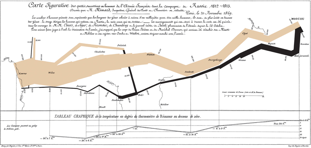
Take a look at this gem of a graphic by Charles Joseph Minard. This “flow map” represents Napoleon’s disastrous Russian campaign of 1812 (yeah, I know it breaks the bounds of my blog, but I want it to be clear for you to read):
Beginning at the Polish-Russian border, the tan band shows the size of the army advancing towards Moscow. The black lower band represents the path of Napoleon’s retreat from Moscow in the bitterly cold winter of 1812 (with temperature and time scales). The thickness of the respective bands shows the size of the army.
This graphic clearly shows the:
- size of the army (and the scale of the human suffering – note the size of the initial army contrasted with the returning army, and sudden decrease of the army’s size at the crossing of the Berezina river on the retreat)
- geographical coordinates of the army as it moved
- direction the army was moving, both in advance and retreat
- location of the army at different dates
- temperature during the winter of 1812 during the retreat
Edward Tufte calls it “probably the best statistical graphic ever drawn.”
What do you think?


I agree Moira, and confess that I am guilty of enjoying some of the colorful monstrosities that have come out of the current rage, even when they don’t enhance my understanding. I’m trying to be more discerning.
Regards,
Jeri
True, Jeri, some of them really are very visually appealing. Usually they have enough negative space to give the eye some rest. Thx, Moira