
Archive | Graphics RSS feed for this section
The Secret to a Great Info-Graphic
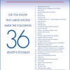
I’ve been noticing a trend in info-graphics recently – a huge collection of facts, done in a certain style. They’re usually very tall – 500 x 2000 pixels, and colorful/dramatic. So what’s wrong with this picture? Well, they’re ineffective. There’s a lot of data, and it’s all pretty hard to read. They don’t tell a […]
“The Art of Explaining Stuff”
I read an article* today on The Art of Explaining Stuff. Explaining is what people in the communication fields do for a living, and we always like to learn how to do it better. The techniques listed in the article tied in well with what I’ve learned – and I thought back to where I […]
Radiation Infographic
With further heartbreaking events unfolding in already hard-hit Japan, I created an infographic this morning on Radiation terminology and effects — as a way to understand terms with which I’ve grown unfamiliar, and as a public service. For an excellent Q&A, please see Richard Warry’s article in today’s BBC News on the health effects of […]
Be a Trim Tab – ‘greening’ your business
Buckminster Fuller, renowned author, designer, engineer, futurist and inventor, wrote: “Something hit me very hard once, thinking about what one little man could do. Think of the Queen Mary – the whole ship goes by and then comes the rudder. And there’s a tiny thing at the edge of the rudder called a trim tab. […]